As Huckabuy expands, we will continue to help more companies achieve Google’s Perfect World by technically optimizing their website(s) through software solutions. As we do this, it’s important that we maintain consistent brand guidelines to keep our brand accessible and cohesive. This applies to typography and other visual elements including font, logos, and colors.
If you have questions about our brand guidelines, feel free to contact our creative director: [email protected]. Thank you for helping us maintain our brand standard.
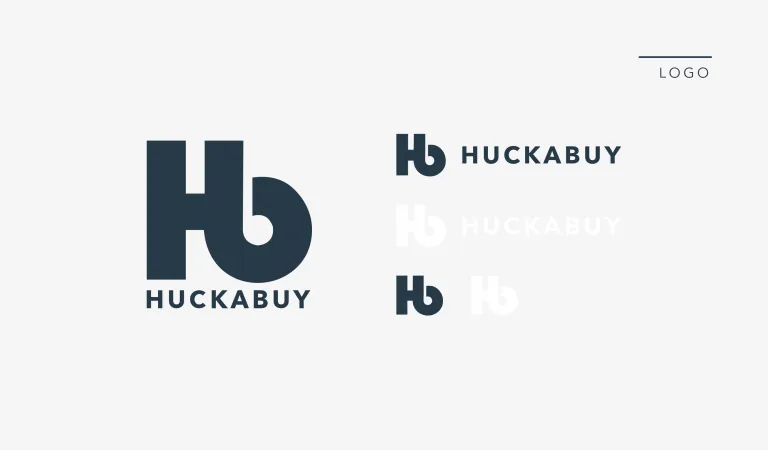
Logos

Download the logo pack
Below are the guidelines and parameters for the Huckabuy logo and symbols. These guidelines are put in place to ensure consistent legibility and recognition.
Logo Best Practices
- Don’t add drop shadows
- Don’t use the wordmark alone
- Don’t squeeze or stretch the logo
- Don’t rotate the logo
- Don’t use a gradient with the logo
- Don’t change the color of the logos
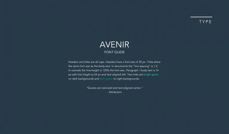
Typography

Huckabuy’s font is Avenir, a clear and versatile font.
Colors

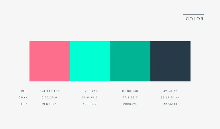
The following colors represent the Huckabuy brand.
- White: 255.255.255 | 0.0.0.0 | #FFFFFF
- Pink: 253.110.138 | 0.72.25.0 | #FD6E8A
- Turquoise: 0.255.210 | 55.0.34.0 | #00FFD2
- Green: 0.180.148 | 77.1.55.0 | #00B494
- Navy: 39.58.72 | 85.67.51.44 | #273A48